Typography and grammar meet wherever a writer chooses how words look on the page or the screen. Italics tell the reader that a word is a title, a foreign term, or a stressed word. Quotation marks tell the reader that words are someone’s, or that a work is short. Capital letters tell the reader that a word is a name, a start, or a shout. Spacing and layout tell the reader where one idea ends and another begins. These are the signals of visual grammar, and like the signals of punctuation they carry meaning: a reader who sees The Hindu in italics reads a newspaper title, and a reader who sees “Why Grammar Matters” in quotation marks reads the title of an article.
This chapter covers the typography rules that every serious writer needs: italics, bold, quotation marks versus italics, advanced capitalization, numbers and figures as they appear on the page, and spacing and layout. It also treats the grammar of lists and headings, which is where text formatting and sentence grammar overlap, and the effect of typography on readability and accessibility. The chapter is about conventions and the reasons for them: where style guides differ, it says so. Thirty exercises and a quiz follow.
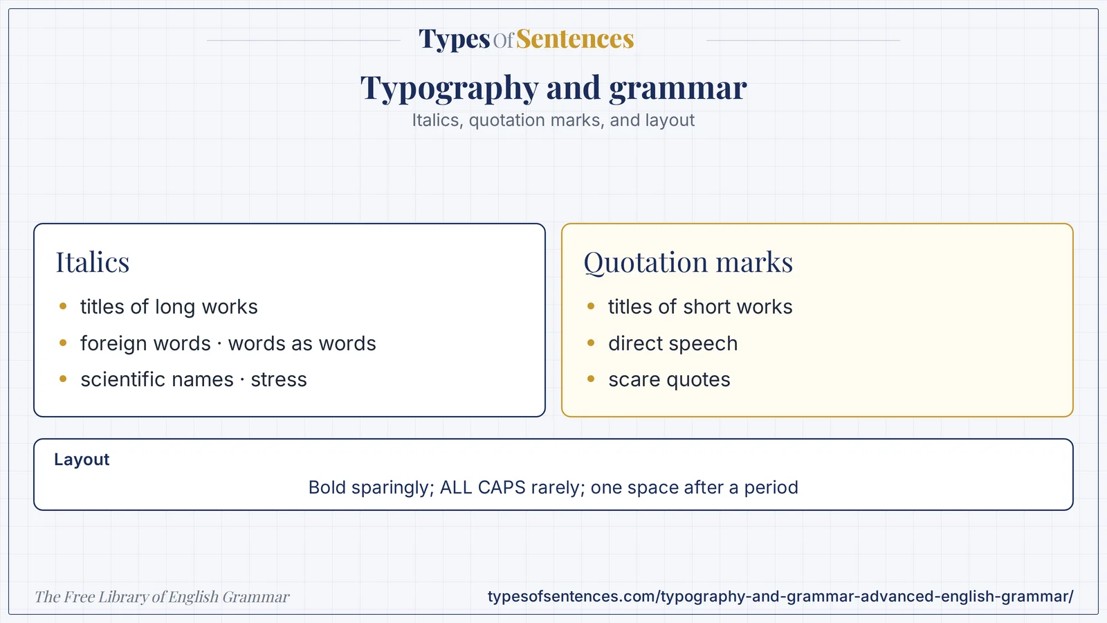
Formatting is part of the message. Italics, bold, capitals, quotation marks, and spacing each have a job, and using them for the wrong job confuses the reader or makes the page hard to read.
Why it matters: Use few kinds of emphasis, use each consistently, and make sure the formatting still works for people who cannot see it (for example when read aloud by a screen reader).
Summary: Italics mark titles of long works, foreign words not yet naturalized, words as words, scientific names, and stress; quotation marks mark titles of short works, direct speech, and scare quotes. Bold is for headings, key terms, interface labels, and warnings, and should not be combined with italics for ordinary emphasis. All capitals reduce readability and read as shouting online; camel case hashtags aid screen readers. Numbers need consistent figures, separators, and non-breaking spaces. One space follows a period; body paragraphs are either indented or separated by space, not both; line length of roughly 45 to 75 characters aids reading. Lists need a clear lead-in, parallel items, and consistent punctuation and capitalization. Good typography supports accessibility: contrast, structure, and text that does not depend on color alone.
- Italics for titles of long works, foreign words, words as words.
- Bold sparingly; ALL CAPS rarely.
- One space after a period; consistent layout.
- Parallel list items; accessible formatting.
What You’ll Learn
- 1. Typography and Grammar: Italics
- 2. Bold: When to Use It, and Emphasis vs Italics
- 3. Quotation Marks vs Italics: Titles of Works
- 4. Capital Letters: Advanced Conventions and the Internet Age
- 5. Numbers and Figures: How They Appear on the Page
- 6. Spacing and Layout: Sentences, Paragraphs, and Pages
- 7. The Grammar of Lists, Headings, and Captions
- 8. Common Typographic Errors and a Worked Example
- 9. Exercises
- 10. Test Your Knowledge
- 11. Frequently Asked Questions
- 12. Conclusion
1. Typography and Grammar: Italics
| Use of italics | Example | Note |
|---|---|---|
| titles of long or complete works | Pride and Prejudice; The Hindu; Casablanca | books, films, newspapers, journals, albums, plays, long poems |
| names of ships, aircraft, and spacecraft | the Titanic; Chandrayaan-3 | the abbreviation before the name (INS, SS) is not italicized |
| foreign words and phrases not yet in English dictionaries | a fait accompli is a settled matter; the dabbawalas of Mumbai | many styles do not italicize words that are in standard English dictionaries (cafe, bazaar, karma) |
| words, letters, and numbers as themselves | the word literally; the letter q; the number 7 | quotation marks are an alternative in some styles |
| emphasis | I said tomorrow, not today. | use sparingly |
| scientific names (genus and species) | Homo sapiens; Mangifera indica | genus capitalized, species lowercase |
| legal case names (in running text, in most styles) | Brown v. Board of Education | citations differ by style |
| thoughts and unspoken words (in fiction) | I should go, she thought. | a convention of fiction |
| a term at its first, defining use | a gerund is a verb form that functions as a noun | textbook convention (bold is the alternative) |
| variables in mathematics and statistics | p < .05; n = 40 | APA uses italics for statistical symbols |
| stage directions and notes to readers | — | — |
| “emphasis added” in quotations | in brackets after the quotation | — |
| volume titles in citations | Journal of Linguistics | style-dependent |
| Do not italicize | Reason |
|---|---|
| titles of short works (articles, poems, songs, chapters) | they take quotation marks |
| the names of holy books and their parts (in most styles) | Bible, Quran, Gita are not italicized in Chicago style |
| common foreign words that are naturalized | résumé is usually roman |
| names of well-known organizations | — |
| whole paragraphs for emphasis | hard to read; italics suit short stretches |
| text in a title that is already italic (use roman for contrast) | a book title inside an italic title is set roman |
| punctuation after italic text (usually roman) | the comma after a title is roman in most styles |
| brand names (in most styles) | — |
| email addresses and URLs | — |
| Italics and quotation marks together | Rule |
|---|---|
| a short work inside a long work’s title | Reading “The Raven” Aloud |
| a long work inside an article’s title | “Rereading Hamlet” |
| a word as a word with a definition | bank means “the side of a river” (italic word, quoted meaning) |
| emphasis in a quotation | add [emphasis added] after the quotation |
| italic with an apostrophe or possessive | Hamlet’s soliloquy (the possessive ending is roman in Chicago style) |
Italics are for contrast: the eye notices them because they differ from the surrounding text. A page with too many of them loses the contrast, which is the reason that style guides advise using italics for emphasis sparingly. Typographic italics should be made with the font’s italic style and not with underlining, which in print is a stand-in for italics on a typewriter and on the web usually signals a link.
2. Bold: When to Use It, and Emphasis vs Italics
| Use of bold | Example | Note |
|---|---|---|
| headings and subheadings | Methods | the commonest use |
| key terms at their first, defining use (textbooks) | a clause is a group of words with a subject and a verb | a glossary convention |
| interface labels and button names in instructions | click Save | a technical-writing convention |
| warnings and cautions | Warning: do not touch | combined with a label |
| the lead-in of a list item | Plan. Decide the aim. | scannable lists |
| run-in headings | Step 1. Open the file. | — |
| emphasis in web and business writing | the deadline is Friday | use rarely; a few bold words per page |
| names in a script or directory | PRIYA: Hello. | — |
| keywords in abstracts or summaries | — | — |
| table headers | — | — |
| Bold or italics? | Choice |
|---|---|
| title of a book | italics |
| a heading | bold (or a larger size) |
| a stressed word in a sentence | italics (bold if the style guide prefers it for the web) |
| a key term being defined | italics or bold; be consistent |
| a foreign word | italics |
| an interface button | bold |
| a warning | bold, with a label |
| a long passage | neither (use a block quotation or a box) |
| both at once | avoid except in headings and special cases |
- Do not bold whole paragraphs. If everything is bold, nothing stands out.
- Do not mix bold, italics, underlining, and color for one kind of emphasis.
- Do not rely on bold alone to carry an essential meaning; screen readers usually do not announce it. Say it in words as well.
- Use real headings (heading styles) and not bold text, so that the page has a structure that software can read.
- Keep bold for scanning. Readers skim web pages, and bold lead-ins help them.
Bold is a tool of the page and the screen more than of continuous prose. In formal academic writing it is rare, and APA style, for example, reserves bold for headings and for certain table and statistical conventions. The reader’s eye reads emphasis as importance, so the writer must choose what is important.
3. Quotation Marks vs Italics: Titles of Works
| Work | Italics (long or whole works) | Quotation marks (short or part of a larger work) |
|---|---|---|
| book | The Guide | — |
| chapter of a book | — | “Beginnings” |
| newspaper or magazine | The Hindu; The Economist | — |
| article in a newspaper or journal | — | “Why Grammar Matters” |
| journal | Applied Linguistics | — |
| poem (short) | — | “Ozymandias” |
| poem (book-length) | Paradise Lost | — |
| song | — | “Jana Gana Mana” |
| album | Thriller | — |
| film | Lagaan | — |
| television series | Sherlock | — |
| episode of a series | — | “The Reichenbach Fall” |
| play | Hamlet | — |
| website (as a whole) | Wikipedia (style-dependent) | — |
| web page or post | — | “How to Use Commas” |
| short story | — | “The Gift of the Magi” |
| essay | — | “Politics and the English Language” |
| painting or sculpture | The Starry Night | — |
| opera or long musical work | La Traviata | — |
| podcast series; podcast episode | Radiolab | “The Wheel of Time” |
| software and apps | usually roman with capitals (Microsoft Word) | — |
| video game | Minecraft (style-dependent) | — |
| sacred texts | roman (the Bible, the Quran) | — |
| Acts and laws | roman (the Companies Act) | — |
| conference papers and lectures | — | “Grammar in Context” |
| unpublished thesis or dissertation | — | “A Study of Articles” (or italics in some styles) |
| a lecture series | The Reith Lectures | — |
| reports and white papers | Annual Report (style-dependent) | — |
| exhibition or festival | roman or italics, style-dependent | — |
| Style differences (check your guide) | Chicago and MLA | APA | AP |
|---|---|---|---|
| book and journal titles | italics | italics | quotation marks for most titles, including books |
| article titles | quotation marks | no marks or italics in reference lists; quotation marks in text | quotation marks |
| website titles | italics (MLA); roman or italics (Chicago) | italics (as a whole site) or plain | roman or quotation marks |
| capitalization in titles | headline style (title case) | title case in text; sentence case in reference lists | title case |
| apostrophes and possessives | roman after an italic title (Chicago) | — | — |
The principle is simple: a work that stands alone (a book, a film, a journal) takes italics, and a work that is part of something larger (a chapter, an article, a song on an album) takes quotation marks. Newspaper style (AP) departs from this and uses quotation marks for most titles because of the limitations of newsprint typesetting; if you write for a particular publication, follow its guide. The capitalization of titles is treated in the chapter on title capitalization.
4. Capital Letters: Advanced Conventions and the Internet Age
| Convention | Example | Note |
|---|---|---|
| ALL CAPS for emphasis online | STOP DOING THAT | reads as shouting; avoid in professional writing |
| ALL CAPS for headings, warnings, and labels | DANGER; NOTE | acceptable in short labels and signs |
| ALL CAPS for acronyms and initialisms | NASA; PDF | — |
| small caps | dates in some styles; headings in books | a typographic style, made with the font feature |
| camel case or Pascal case in hashtags | #GrammarMatters; #SundayReading | capitalizing each word helps screen readers and human readers |
| camel case in brand names and software terms | iPhone; eBay; YouTube; JavaScript | follow the brand’s own style where established |
| lowercase brand names (style choice) | adidas; easyJet | often capitalized at the start of a sentence in running text |
| capitalizing Internet and Web | the Internet (older); the internet (now common) | AP and Chicago now use lowercase; see the chapter on technology |
| the pronoun I | I think | lowercase i in text messages is informal |
| capitalizing every word in a sentence | Please Read The Notice | not standard; a style for headings only |
| capitalizing the first word of a quotation that is a full sentence | She said, “We will go.” | — |
| capitalizing after a colon | style-dependent | see the chapter on advanced punctuation |
| capitalizing job titles | President Rao; the president | before a name yes; after or alone usually no |
| capitalizing compass points | the North (a region); go north | regions yes, directions no |
| capitalizing seasons | spring; summer | no, unless personified or in a title |
| capitalizing names of days, months, languages, nationalities | Tuesday; April; Hindi; Indian | yes |
| capitalizing generic names of institutions | the university (generic); Anna University | specific names yes |
| capitalizing family titles | Mother, I am home. / my mother | as a name yes; as a common noun no |
| sentence case in interface text | Save as; Open file | modern interface style |
| title case in headings | How to Write a Report | see the chapter on title capitalization |
| capital letters in the middle of a word (initialisms and acronyms with lowercase) | PhD; MSc; kHz | follow the established form |
| Roman numerals | Chapter IV; World War II | capitals |
| the first word after a line of poetry | traditionally capitalized; modern verse varies | — |
| ALL CAPS and readability | Finding |
|---|---|
| continuous text in capitals is slower to read than in lowercase | research on reading since the early twentieth century (for example Tinker) has found this, because capitals make word shapes less distinct |
| capitals suit short labels | signs, warnings, headings |
| capitals online signal shouting | netiquette guides advise against them |
| screen readers may spell out capitalized words | as if they were acronyms |
| legal and warning texts often use capitals | research doubts that they help comprehension |
- Reserve all capitals for short labels and acronyms.
- Use camel case in hashtags for accessibility.
- Follow a brand’s own spelling of its name, as long as it does not harm readability.
- Follow one style guide for the capitalization of job titles and generic terms.
- Do not capitalize for importance. The Project and The Team in an ordinary sentence are errors.
5. Numbers and Figures: How They Appear on the Page
The rules for when to write numbers in words and when in figures are treated in the next-but-one chapter. This section concerns the typography of figures once you have decided to use them.
| Feature | Convention | Example |
|---|---|---|
| thousands separator | commas in American and British style; thin spaces in SI style; the Indian system groups the last three digits and then pairs | 1,000,000 (international); 10,00,000 (Indian lakh style) |
| decimal marker | a point in English-language writing; a comma in much of Europe | 3.14 versus 3,14 |
| non-breaking space | between a number and its unit, so that they stay on one line | 25 kg; 10 a.m.; 5 °C |
| space before percent | APA, Chicago, and AP: no space; SI and some European styles: space | 25%; 25 % |
| currency symbol | before the number in English: ₹500; $20; £5 | a space after the symbol only in some styles |
| minus sign | the true minus (−), not a hyphen | −5 |
| multiplication sign | ×, not the letter x | 3 × 4 |
| fractions | a hyphenated word in text; a slash or a symbol in tables | two-thirds; 2/3; ⅔ |
| ranges | an en dash between numbers | pp. 10–20 |
| dates | day month year, or month day, year | 4 March 2024; March 4, 2024; 2024-03-04 (ISO) |
| times | a colon; 12-hour with a.m./p.m. or 24-hour | 3:30 p.m.; 15:30 |
| lining versus old-style figures | lining figures are all the same height; old-style figures have varying heights | a choice of font; lining for tables |
| tabular versus proportional figures | tabular figures are equal in width and align in columns | use tabular figures in tables |
| alignment in tables | align numbers on the decimal point or to the right | — |
| units | a space between number and unit, except for % and ° in some styles | 10 km |
| ordinal suffixes | 1st, 2nd, 3rd, 4th | superscript or not, according to style |
| telephone numbers | group by region | +91 80 1234 5678 |
| large-number abbreviations | k, M, B (informal); thousand, million, billion | ₹5 lakh; 5 million |
| Roman numerals | capital I, V, X | Chapter IV |
| avoiding line breaks | a non-breaking hyphen or space | — |
| numerals in a sentence start | spell out or reword | see the chapter on numbers |
| scientific notation | a multiplication sign and a power of ten | 3 × 10⁸ |
| percentages and decimals | a figure with the symbol in technical text; percent in some prose styles | 25%; 25 percent |
| negative numbers in finance | a minus sign or parentheses | −500; (500) |
| numbers in lists | right-aligned or consistent | — |
| leading zeros | used in times and codes | 07:05; 007 |
| letters and numbers confusion | O and zero; l and one | use a clear font in codes |
| gender-neutral tables | — | — |
| IDs and codes | consistent grouping | ABC-1234 |
| page and line numbers | figures | p. 12; line 4 |
| numerals in titles | as in the title | Fahrenheit 451 |
The Indian numbering system, with its lakh (one hundred thousand) and crore (ten million), is standard in Indian publications and is understood throughout South Asia; for an international reader, give the international figure too, or use million and billion. Consistency within a document is the main rule.
6. Spacing and Layout: Sentences, Paragraphs, and Pages
| Feature | Convention | Reason |
|---|---|---|
| space after a period | one space (modern style guides, including Chicago and APA 7th edition) | two spaces were a typewriter convention for monospaced type; proportional fonts do not need them |
| paragraph indentation | indent the first line (in print, except after a heading), or leave a blank line between paragraphs (block style, common on the web); not both | one signal is enough |
| line length | roughly 45 to 75 characters per line for comfortable reading (a common recommendation in typography handbooks) | longer lines tire the eye; shorter lines break the rhythm |
| line spacing (leading) | about 1.2 to 1.5 times the font size for body text | readability |
| alignment | left-aligned (ragged right) is easiest for most readers; justified text needs good hyphenation | uneven spaces in justified text can create “rivers” |
| font size | at least 10 to 12 points for print body text; 16 pixels or more on screens | readability |
| serif versus sans serif | serif is traditional for long print; sans serif is common on screens; both can work | a matter of design and legibility |
| font choice | one or two families per document | coherence |
| headings | a clear hierarchy (level 1, level 2, level 3) using real heading styles | structure and navigation |
| white space | margins, space between sections | visual rest |
| widows and orphans | avoid a single line of a paragraph alone at the top or bottom of a page | appearance |
| hyphenation | allow in justified text; avoid in headings and narrow columns | even spacing |
| spaces around dashes | style-dependent (closed em dash in Chicago and APA) | consistency |
| non-breaking spaces | between a title and a name (Dr. Rao), a number and a unit, and in dates | keeps units together |
| tabs versus spaces | use tabs or indents, not multiple spaces, for alignment | structure |
| straight versus curly quotation marks | use typographic (curly) quotation marks and apostrophes | correctness and appearance |
| ellipsis character or three dots | style-dependent; be consistent | — |
| lists | bullets for unordered items, numbers for steps | function |
| tables and figures | captions, consistent formatting | clarity |
| page numbers and running heads | in long documents | navigation |
| line breaks within words | avoid manual line breaks in paragraphs | reflow on different screens |
| contrast | dark text on a light background with a contrast ratio of at least 4.5 to 1 for body text (WCAG) | accessibility |
| color alone | do not use color alone to convey meaning | accessibility |
| alternative text for images | a short description | accessibility |
| link text | descriptive text, not click here | accessibility and clarity |
| emoji and symbols | used with text alternatives | accessibility |
| mobile layout | short paragraphs, adequate tap targets | usability |
| email layout | short paragraphs, a clear subject, signature | see the chapter on email |
| document templates | styles for headings, body, quotes | consistency |
| proofing view | show formatting marks to see stray spaces | editing |
| export and conversion | check that formatting survives | — |
| Paragraph style | Indented | Block (spaced) |
|---|---|---|
| look | traditional; compact | modern; open |
| typical use | books, academic papers, fiction | web pages, business documents, emails |
| rule | first line indented; no extra space between paragraphs | no indent; a blank line or space between paragraphs |
| error | indent plus a blank line | indent with spaces instead of a style |
Layout is the part of typography that most affects readability. The relations between layout, style, and the reader’s experience are discussed in the chapters on readability and on writing for digital media. A good rule is to make formatting invisible: if readers notice the typography, it is probably getting in the way.
7. The Grammar of Lists, Headings, and Captions
| Element | Guideline | Example |
|---|---|---|
| lead-in for a list | end with a colon after a complete clause; do not put a colon after a verb or preposition that continues the sentence | The report has three parts: |
| parallel items | each item has the same grammatical form | Plan the work; do the work; check the work. |
| items that complete a sentence | begin lowercase and end with a comma or semicolon; the last ends with a period | The committee will (1) review the plan, (2) approve the budget, and (3) set the date. |
| items that are full sentences | begin with a capital and end with a period | Every item is a full sentence. |
| items that are fragments | capitalization and end punctuation are consistent (many styles omit end punctuation) | Budget; Timeline; Risks |
| numbered lists | for steps and ranked items | 1. Open the file. |
| bulleted lists | for items without order | — |
| nested lists | indent, with a different bullet | — |
| headings | parallel in form; sentence case or title case consistently | Planning; Doing; Checking |
| heading questions or statements | consistent | How do I begin? |
| no punctuation after headings (usually) | a heading does not take a period | — |
| table headings | short, parallel nouns | Name; Date; Amount |
| captions | a label and a title or a sentence; consistent style | Figure 2. Growth in enrollment |
| alt text | a short sentence describing the image | — |
| page titles and subject lines | see the chapters on titles and on email | — |
| callouts and notes | a label, a colon, and a short text | Note: … |
| definition lists | term and definition | — |
| List problem | Example | Repair |
|---|---|---|
| non-parallel items | *We need to: hire staff, a new budget, and training. | We need to hire staff, approve a new budget, and start training. |
| a colon after a verb | *The topics are: grammar, style. | The topics are grammar and style. |
| mixed punctuation | items with periods and without | choose one |
| mixed capitals | *budget; Timeline; risks | Budget; Timeline; Risks |
| a list item that does not fit the lead-in | *The plan will: include a budget, and the council agreed. | The plan will include a budget. |
| too many levels | four nested levels | two levels at most |
| one-item lists | a bullet with one item | write a sentence |
| long items in a bullet list | paragraph-length bullets | use paragraphs or a table |
| a list of unrelated items | — | group or rewrite |
Parallelism in lists is the same principle as parallelism in sentences, treated in the chapter on parallel structure. A list is a sentence broken into parts, and each part must fit the sentence that introduces it.
8. Common Typographic Errors and a Worked Example
| Error | Example | Correction |
|---|---|---|
| italics for a short work | *the poem Ozymandias | the poem “Ozymandias” |
| quotation marks for a book title (outside AP style) | *“Pride and Prejudice” | Pride and Prejudice |
| underline for italics in a web text | underlined title | italics (underline looks like a link) |
| all capitals for emphasis | *THIS IS URGENT | This is urgent. / This is urgent. |
| bold paragraphs | a whole paragraph in bold | use bold for a few key words |
| two spaces after a period | *end. Next | end. Next |
| indent and blank line together | — | choose one |
| straight quotation marks and apostrophes in a finished text | straight marks instead of typographic ones | curly (typographic) quotation marks and apostrophes |
| hyphen for a dash or a range | *pages 10-20; *word – word | pages 10–20; word—word |
| a space before a comma or after an opening bracket | *word , word; ( word ) | word, word; (word) |
| inconsistent capitalization of headings | Planning / next Steps | Planning / Next Steps |
| non-parallel headings | Planning; How to Do It; Checking the work | Planning; Doing; Checking |
| a list that does not match its lead-in | — | rewrite |
| unit separated from number at a line break | 25 / kg on two lines | a non-breaking space |
| a hashtag in lowercase | #grammarmatters | #GrammarMatters |
| color alone to show meaning | red for errors, green for correct, with no other signal | add symbols or words |
| click here as link text | — | descriptive link text |
| justified text with rivers | — | left-align or hyphenate |
| too many fonts | four fonts on a page | one or two |
| tiny type | 7 pt body text | 10 to 12 pt |
Edit the formatting of this passage: THE REPORT “A Study of Articles” was published in the journal Applied Linguistics. It has 3 parts: Introduction, how to write, and Conclusions. See pages 10-20 – CLICK HERE. #grammarmatters
- THE REPORT: all capitals for emphasis: The report.
- “A Study of Articles”: the title of an article takes quotation marks, and they should be typographic (curly) marks: correct as written.
- the journal Applied Linguistics: a journal title takes italics: the journal Applied Linguistics.
- . It: two spaces: one space.
- 3 parts: Introduction, how to write, and Conclusions: the list is not parallel and not consistently capitalized: three parts: Introduction, Method, and Conclusions (a figure for 3 is acceptable in some styles, but a word is usual: three).
- pages 10-20 – CLICK HERE.: a hyphen for a range, a spaced hyphen as a dash, capitals, and a non-descriptive link: pages 10–20; the link text: read the full report.
- #grammarmatters: #GrammarMatters.
- Result: The report “A Study of Articles” was published in the journal Applied Linguistics. It has three parts: Introduction, Method, and Conclusions. See pages 10–20, or read the full report. #GrammarMatters (the report is invented)
Recap in 12 seconds
Watch the lesson build itself: Italics and quotation marks mark different kinds of text; bold and capitals should be used sparingly. The video has no sound.
Exercises
Part A: Italics (Exercises 1–6)
Exercise 1: Italicize or quote: the novel Emma.
Show Answer
Answer: Italics.
Exercise 2: Italicize or quote: the poem “The Raven”.
Show Answer
Answer: Quotation marks.
Exercise 3: Italicize or not: the word literally as a word.
Show Answer
Answer: Italicize (or quote, per style).
Exercise 4: Italicize or not: the name of a ship.
Show Answer
Answer: Italicize.
Exercise 5: Italicize or not: a naturalized word such as cafe.
Show Answer
Answer: No.
Exercise 6: How are scientific names styled?
Show Answer
Answer: Genus and species in italics; the genus capitalized.
Part B: Bold and Titles (Exercises 7–13)
Exercise 7: Name two uses of bold.
Show Answer
Answer: Headings; interface labels; key terms; warnings.
Exercise 8: Why not bold whole paragraphs?
Show Answer
Answer: Nothing stands out.
Exercise 9: Italics or quotation marks: an article in a journal.
Show Answer
Answer: Quotation marks.
Exercise 10: Italics or quotation marks: a film.
Show Answer
Answer: Italics.
Exercise 11: Italics or quotation marks: a song.
Show Answer
Answer: Quotation marks.
Exercise 12: Italics or quotation marks: a TV series.
Show Answer
Answer: Italics.
Exercise 13: Which style often uses quotation marks for book titles?
Show Answer
Answer: AP.
Part C: Capital Letters (Exercises 14–19)
Exercise 14: Why avoid ALL CAPS in professional writing?
Show Answer
Answer: It reads as shouting and is harder to read.
Exercise 15: Rewrite for accessibility: #grammarmatters
Show Answer
Answer: #GrammarMatters.
Exercise 16: What is camel case?
Show Answer
Answer: Capitalizing each word of a joined phrase.
Exercise 17: Capitalize: president Rao before a name.
Show Answer
Answer: President Rao.
Exercise 18: Capitalize or not: the university (generic).
Show Answer
Answer: No.
Exercise 19: Name a use of small caps.
Show Answer
Answer: Headings; dates in some styles.
Part D: Numbers and Layout (Exercises 20–26)
Exercise 20: How many spaces after a period?
Show Answer
Answer: One.
Exercise 21: Which dash for 10–20?
Show Answer
Answer: An en dash.
Exercise 22: Why a non-breaking space in 25 kg?
Show Answer
Answer: To keep the number and unit together.
Exercise 23: Name two ways to separate paragraphs.
Show Answer
Answer: Indentation or a blank line (not both).
Exercise 24: What is a good line length?
Show Answer
Answer: About 45 to 75 characters.
Exercise 25: What contrast ratio does WCAG require for body text?
Show Answer
Answer: At least 4.5 to 1.
Exercise 26: Write 1000000 in the Indian system.
Show Answer
Answer: 10,00,000.
Part E: Lists and Editing (Exercises 27–30)
Exercise 27: Repair: *We need to: hire staff, a budget, and training.
Show Answer
Answer: We need to hire staff, approve a budget, and start training.
Exercise 28: Repair: *The topics are: grammar, style.
Show Answer
Answer: The topics are grammar and style.
Exercise 29: Replace the link text click here.
Show Answer
Answer: Descriptive text: read the full report.
Exercise 30: Why use real heading styles?
Show Answer
Answer: They give the page a structure that software and screen readers can use.
Test Your Knowledge
Ready to check what you learned? Answer all 10 questions, then submit. You need 80% (8 of 10) to pass. Your answers are not stored.
View correct answers and explanations
Question 1: Which takes italics?
✓ Correct Answer: A – a book title
Long works take italics.
Question 2: Which takes quotation marks?
✓ Correct Answer: B – a poem
Short works take quotes.
Question 3: Which is best for a hashtag?
✓ Correct Answer: C – #GrammarMatters
Camel case.
Question 4: How many spaces follow a period in modern style?
✓ Correct Answer: D – one
One.
Question 5: Which dash is used for ranges?
✓ Correct Answer: C – en dash
En dash.
Question 6: Which is a good reason to avoid all capitals in text?
✓ Correct Answer: A – it is harder to read and reads as shouting
Readability.
Question 7: Which is a good line length?
✓ Correct Answer: D – about 45 to 75 characters
A comfortable range.
Question 8: What does a non-breaking space do?
✓ Correct Answer: C – keeps two items on one line
Keeps number and unit together.
Question 9: Which list is parallel?
✓ Correct Answer: B – hire staff, approve a budget, and start training
Same grammatical form.
Question 10: Why use heading styles and not bold text for headings?
✓ Correct Answer: B – they give the page a structure that software can read
Structure for software.
Frequently Asked Questions
What is typography and grammar?
Typography and grammar is the study of how formatting choices, such as italics, bold, capitals, quotation marks, and spacing, carry meaning and follow conventions. Typography and grammar together make up the visual side of writing.
What is grammar typography?
Grammar typography is the set of typographic conventions that signal grammatical and textual functions: italics for titles, quotation marks for short works, capitals for names, and parallel formatting for lists. Grammar typography helps readers to parse the text.
What are the basics of text formatting?
Use italics for long works, foreign words, and words as words; bold for headings and labels; one space after a period; consistent paragraphs; and parallel lists. Text formatting should help the reader and not decorate the page.
What is visual grammar?
Visual grammar is the way that the look of a text (headings, lists, spacing, type) signals its structure and meaning. Visual grammar works like the grammar of sentences: it follows conventions that readers learn.
What are the main typography rules?
Titles of long works in italics and short works in quotation marks; few kinds of emphasis; capitals for names, not for shouting; one space after a period; curly quotation marks; and accessible contrast. These typography rules vary slightly by style guide.
Should I use bold or italics for emphasis?
Use italics for emphasis in running prose, sparingly; use bold for headings, labels, and warnings; and do not combine them for ordinary emphasis.
Why is all capitals discouraged?
Because text in capitals is slower to read and reads as shouting online; it is acceptable for short labels and acronyms.
Conclusion
You now have a guide to typography and grammar: italics, bold, titles, capitals, the typography of numbers, spacing and layout, and the grammar of lists. You can format a text so that its appearance supports its meaning.
When you format, ask what each choice signals and whether it helps the reader. Next, you will study abbreviations and acronyms.
- Bringhurst, Robert. The Elements of Typographic Style. 4th ed. Hartley and Marks, 2012.: the standard handbook of typographic practice.
- The Chicago Manual of Style. University of Chicago Press. (check the current edition): italics, quotation marks, numbers, and spacing.
- Publication Manual of the American Psychological Association. 7th ed. American Psychological Association, 2020.: formatting conventions in APA.
- World Wide Web Consortium. Web Content Accessibility Guidelines (WCAG) 2.1. 2018.: contrast and accessibility requirements.
- Merriam-Webster Dictionary: typography: the dictionary entry.
Last reviewed: October 29, 2026. How it was made: drafted with AI assistance, then checked with automated tests (structure, links, answer keys, spelling) and against the sources above. A person has not yet read this chapter line by line. Found a mistake? Report it.